- Offerings
- Tools & Platforms
Tools & Calculators
- Open API
- Calculators
- SIP Calculator
- CAGR Calculator
- Compound Interest Calculator
- FD Calculator
- RD Calculator
- EPF Calculator
- Retirement Calculator
- HDFC SIP Calculator
- Mutual Fund Return Calculator
- Lumpsum Calculator
- Step Up SIP Calculator
- ETF SIP Calculator
- Brokerage Calculator
- Equity Margin Calculator
- SWP Calculator
- EMI Calculator
- MTF Calculator
- Pricing
- SKY Learn
- Mutual Funds
- Margin Trading
- Financial Planning
- Personal Finance
- Share Trading
- IPO
- Derivatives
- Currencies
- Intraday Trading
- Trading Strategies
- Demat Account
- Commodity
- ETF
Other Popular Indicators
By HDFC SKY | Updated at: Apr 24, 2025 03:14 PM IST
Summary
So far in this module, we have covered the commonly used technical indicators. Let’s look at a few more that are not as common but are just as powerful in predicting the price action.
Ichimoku Cloud
The Ichimoku Cloud was developed by a Japanese journalist Goichi Hosoda in the late 1930s. It is a moving average-based trend identification indicator that displays support, resistance, momentum, and trend in a single view.
The indicator visualises five data points:
- Tenkan-Sen (Conversion Line): Indicates market trend.
- Kijun-Sen (Base Line): Indicates future price movements.
- Chikou Span (Lagging Span): Today’s closing price projected back 26 days on the price chart.
- Senkou A (Leading Span A): (Tenkan-Sen + Kijun-Sen)/2 plotted 26 periods ahead.
- Senkou B (Leading Span B): (Highest high + Lowest low)/2 calculated over the past 52 time periods and plotted 26 periods ahead.
When the Tenkan-Sen rises above Kijun-Sen the stock’s trend is positive. When Tenkan-Sen falls below Kijun-Sen, the stock’s trend is negative.
The cloud is the area bounded by Senkou A and Senkou B.
When Tenkan-Sen and Kijun-Sen are above the cloud, the stock’s trend is said to be positive. Similarly, when they are below the cloud, the stock’s trend is said to be negative.
Following interpretations about the trend can also be made based on the cloud:
- The trend is up when a stock’s price is above the cloud.
- The trend is down when a stock’s price is below the cloud.
- When Senkou A is rising and is above Senkou B, the uptrend in the stock is said to be strengthening.
- When Senkou A is falling and is below Senkou B, the downtrend in the stock is said to be strengthening.
Keltner Channel
The Keltner Channel is a volatility indicator developed by American grain trader Chester W Keltner. It is similar to Bollinger Bands — covered in Chapter 8.6 of this series — but uses a stock’s high and low prices to determine the channel instead of the standard deviation.
The Keltner Channel consists of three separate lines.
- Middle line: Exponential Moving Average (EMA) of the price (typically 20 periods)
- Upper band: EMA + 2 x ATR
- Lower band: EMA – 2 x ATR
*ATR = Average True Range (typically over 10 or 20 periods)
The upper and lower bands are placed on either side of a stock’s EMA. Together, they form a channel. The angle of the channel helps in identifying the direction of the trend. Hence, a rising channel indicates the prices are rising, while falling or sideways channels indicate the prices are falling or moving sideways.
The channel contracts and expands as per the volatility of the stock. Hence, if the stock is turning more volatile, the area between the upper and lower bands will be wider, and vice versa.
When the stock moves towards the upper band, it is considered bullish, and a move towards the lower band, bearish.
Since the bands move in the direction of a trend, the stock tends to oscillate between them. Hence, they can be interpreted as resistance and support levels.
If the price breaks the channel on either side and the channel starts to angle similarly, a new trend could be underway in that breakout direction.
Parabolic SAR
Developed by J Welles Wilder Jr, the parabolic SAR is used to determine the direction of the trend and spot potential reversals. Wilder Jr was also the creator of the Relative Strength Index (RSI).
On the price charts, it is denoted by a series of dots that are either above or below the stock’s price. A dot below the price indicates the stock is trending upward, while a dot above the price indicates the stock is trending downward.
Any reversal in the position of these dots could indicate a trend reversal.
The parabolic SAR is used by traders to identify entry and exit points. Traders may look to buy the stock when the dots move from above the price to below the price. Similarly, they may look to sell the stock when the dots move from below the price to above the price.
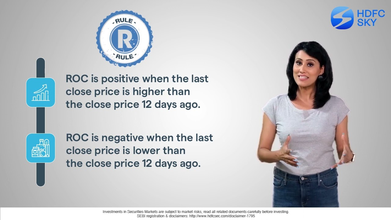
ROC
The Rate of Change (ROC) indicator is a momentum indicator used by traders to identify the speed of a trend.
It measures the percentage change in a stock’s current price from the price a certain number of periods ago (typically 12 days).
ROC = [(Most recent Close – Close 12 periods ago) / (Close 12 periods ago)] x 100
As you can see, the ROC figure can be both negative and positive. A positive figure indicates that the most recent close price is higher than the close price 12 days ago. If the figure is negative, it means the close price 12 days ago is higher than the most recent close price.
On a price chart, the ROC is plotted against a zero line. It moves upwards into positive territory if price changes are to the upside, and moves into negative territory if price changes are to the downside.
Traders can use this to make certain assumptions:
- If the ROC is in positive territory and keeps rising, it indicates that the trend is not only up but the momentum of the uptrend is also accelerating. Similarly, if the ROC is in negative territory and keeps falling, it indicates the momentum of the downtrend is getting stronger.
- If the ROC is above zero but falling, it means that the momentum of the uptrend is slowing. Likewise, when the ROC is below zero but rising, it shows the momentum of the downtrend is decreasing.
Related Articles