- Offerings
- Tools & Platforms
Tools & Calculators
- Open API
- Calculators
- SIP Calculator
- CAGR Calculator
- Compound Interest Calculator
- FD Calculator
- RD Calculator
- EPF Calculator
- Retirement Calculator
- HDFC SIP Calculator
- Mutual Fund Return Calculator
- Lumpsum Calculator
- Step Up SIP Calculator
- ETF SIP Calculator
- Brokerage Calculator
- Equity Margin Calculator
- SWP Calculator
- EMI Calculator
- MTF Calculator
- Pricing
- SKY Learn
- Mutual Funds
- Margin Trading
- Financial Planning
- Personal Finance
- Share Trading
- IPO
- Derivatives
- Currencies
- Intraday Trading
- Trading Strategies
- Demat Account
- Commodity
- ETF
What are price charts, and how do we use them?
By HDFC SKY | Updated at: Apr 8, 2025 03:00 PM IST
Summary
A price chart displays the price of a particular stock over a time series. The Y-axis represents the price of the stock, and the X-axis the time scale. A charting tool plots the prices of the stock from left to right across the X-axis, with the most recent being plotted at the furthest right.
In technical analysis, charting is not only used to see where the price of a stock is at any point in time, but also to make reasonable assumptions of where it might be heading.
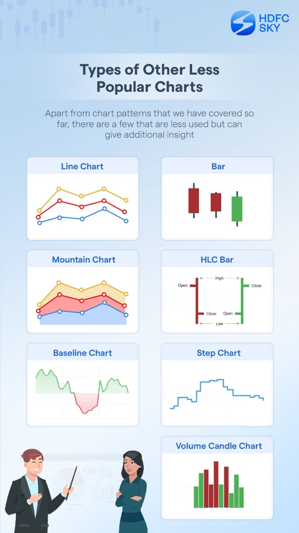
There are three main types of charts ― line charts, bar charts and candlestick charts. Here’s what you need to know about them.
Line Charts
Line charts are the most basic types of charts. These are formed by connecting the closing price of a stock at a point in time (day, week, month) to the next closing price (next day, next week, next month), and so on.
For example, if you are assessing a stock over a one-month time frame, a line chart will connect the closing prices of the stock each day with a line to show you the price movement of the stock over the last 30 days.
While line charts cannot be used for technical analysis, as they fail to demonstrate the volatility of a stock at a particular point in time, it provides users with a quick view of the overall trend of the stock, and support and resistance levels.
Bar Charts
Compared to line charts, bar charts offer much more value to users as it visualises all four data points ― opening, high, low and close.
The top of a bar shows the highest price the stock reached at a particular point in time, while the bottom indicates the close. The left tick indicates the opening price and the right tick denotes the closing price of the stock. Hence, if the left tick is above the right, it means it was a bearish day for the stock, as the opening price was higher than the closing price.
Moreover, the length of the bar shows the price range of the stock during the day. A longer bar is indicative of higher volatility, and vice versa.
Just like line charts, users can choose the time frame as per their needs. So, if you are looking at a stock over a one-hour time frame, a bar chart will show the opening, high, low and close of the stock over each hour in a time series. This is particularly helpful for traders as it depicts the volatility of the stock at each point in time over a period.
Japanese Candlestick charts
As the name suggests, Japanese candlestick charts originated in Japan back in the 18th century. However, it was not until the 1980s that the western world started using this methodology. Decades later, it has become the norm in technical analysis.
Similar to bar charts, Japanese candlestick charts visualise all four data points. But unlike bar charts, they consist of a rectangular body, which is either green or red, depicting bullishness or bearishness in a stock. So, if the market is extremely bullish, you will see a lot of green bodies, and vice versa. This feature is useful in identifying patterns, especially over longer time frames, thanks to its visual appeal.
A candlestick has three components ― upper wick, lower wick and a body. The upper wick indicates the high of stock over a period of time, while the lower wick indicates the low of the stock. The rectangular body connects the opening and closing prices, while its colour indicates bullishness/bearishness in the stock at any given point in time. As with bar charts, the longer the candlestick, the higher the volatility, and vice versa.
Summary
Charting summarises the price action of a stock over a period of time.
Line charts use only one data point from among opening price, high, low and closing price to showcase the general trend of the stock.
Bar chart, an upgrade on the line chart, uses all four data points. Longer the bar, higher the volatility, and vice versa.
Japanese candlesticks are bars with a body. The colour of the body indicates bullishness/bearishness in the stock.
The visual appeal of the Japanese candlesticks makes it easier to spot patterns and trends.
Related Articles